Effective Direct Mail Techniques
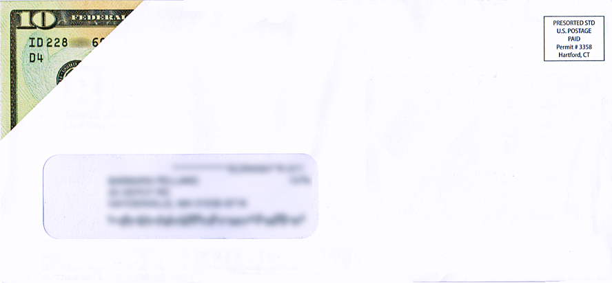
A direct mail piece that was addressed to my wife recently caught my attention when I was sorting through the day’s mail and deciding what made its way into the house to be potentially opened and what would not make it past the blue recycling bins in our garage. This window envelope, printed with what appears to be a $10.00 bill sticking out of the upper left corner where you would expect the return address to appear, really intrigued me. Although we did not “fall” for the gimmick and open the letter, it was sent by one of the large wholesale buying clubs, offering a $10.00 temporary membership.
This got me thinking about direct mail advertising campaigns and how challenging it could be to send out an advertising campaign that would intrigue your recipients enough to persuade them to open the envelope and read your message. I am not including three-dimensional advertising pieces that are expensive to produce, rather limiting this discussion to conventional mailings that any small business can afford to produce and mail. The 8 tips that I am offering for your consideration have proven to be effective. You will not use all of them in one mailing; however, several of these could potentially be combined within a single mailing.
- Use an envelope. Postcards are your least expensive mailing option, and guarantee that they will be at least minimally perused, due to the fact that there is no envelope to open. That said, postcards should be reserved for mailings to existing customers who recognize your business name and are likely to welcome your message. When reaching out to new customers, it is always preferable to use an envelope, adding an element of intrigue; however, there are ways to improve upon that level of intrigue that will, in turn, determine the effectiveness of your campaign.
- Use a stamp. Stamps simply look more personal than a mailing indicia or metered mail. Better than using just one stamp, you can really catch the eye of the recipient by using multiple stamps that total the correct first class mail rate.
- Add personalization. Nothing says “junk mail” more than an envelope that is addressed to “Current Resident” or “Office Manager.” If you do not have the name of a contact – spelled correctly, I might add – do not waste your time, effort and money because you will have truly limited the chances of your message getting read.
- Look Official. This tip can cross the line between tacky and deceptive, but many mailers have found success in printing envelopes that mimic the look of telegrams or Express Mail or Priority Mail graphics. (Be careful not to mimic the latter too closely, or your mailing could be rejected by the postal service!)
- No return address. If you include your return address on the envelope, you will seriously limit the chances of your message getting considered by recipients who might already be predisposed against your business. The lack of return address also adds an element of curiosity that will encourage many people to look further.
- Use a handwriting font. There are quite a few fonts available that mimic handwriting while still remaining readable by automated postal service sorting equipment. Click here for a link to free handwriting fonts on Google. Needless to say, an envelope that appears to be hand-addressed (at least to some people) looks more personal than the more conventionally used mailing fonts. Of course, if your mailing is small enough, real handwriting (keep it legible!) is even better.
- Lumpy mail. Although you have to be careful that your mailing will not get jammed and damaged in automated sorting equipment, and also avoid the surcharge for letters that exceed a maximum one-quarter inch thickness, studies have proven that envelopes clearly containing something are more likely to be opened, particularly if the envelope has a lumpy texture. Ideally, that item should relate to your mailing, in order to take a step beyond simple gimmickry. For example, a teabag with a message that invites the reader to “sit back and relax with a cup of tea, while taking a minute to consider our offer.”
- A yellow repositionable note. These are yellow adhesive notes that are designed specifically for this purpose, with double the adhesive strip (so they stay attached in transit.) These are specialty items that are custom printed by companies on a list of vendors provided by the postal service.
If you will be turning to a mailing house for assistance, they will add the advantages of taking your mailing database and both removing duplicates and running it through the National Change of Address data registry. Mailing services pay enormous fees to the U.S. Postal Service in order to utilize this service, charging end-users a very reasonable service fee that is far less than the money that would otherwise be wasted on mailing to bad addresses.
According to the postal service, approximately 40 million Americans move their place of residence and/or business each year, estimating that at least 8% of all mail is undeliverable due to incorrect addresses. We all know how difficult it is to reach new customers. When direct mail is part of your efforts, do everything possible to make it work, starting with the design of your advertising campaign itself.
This post was written by Peter Pelland

